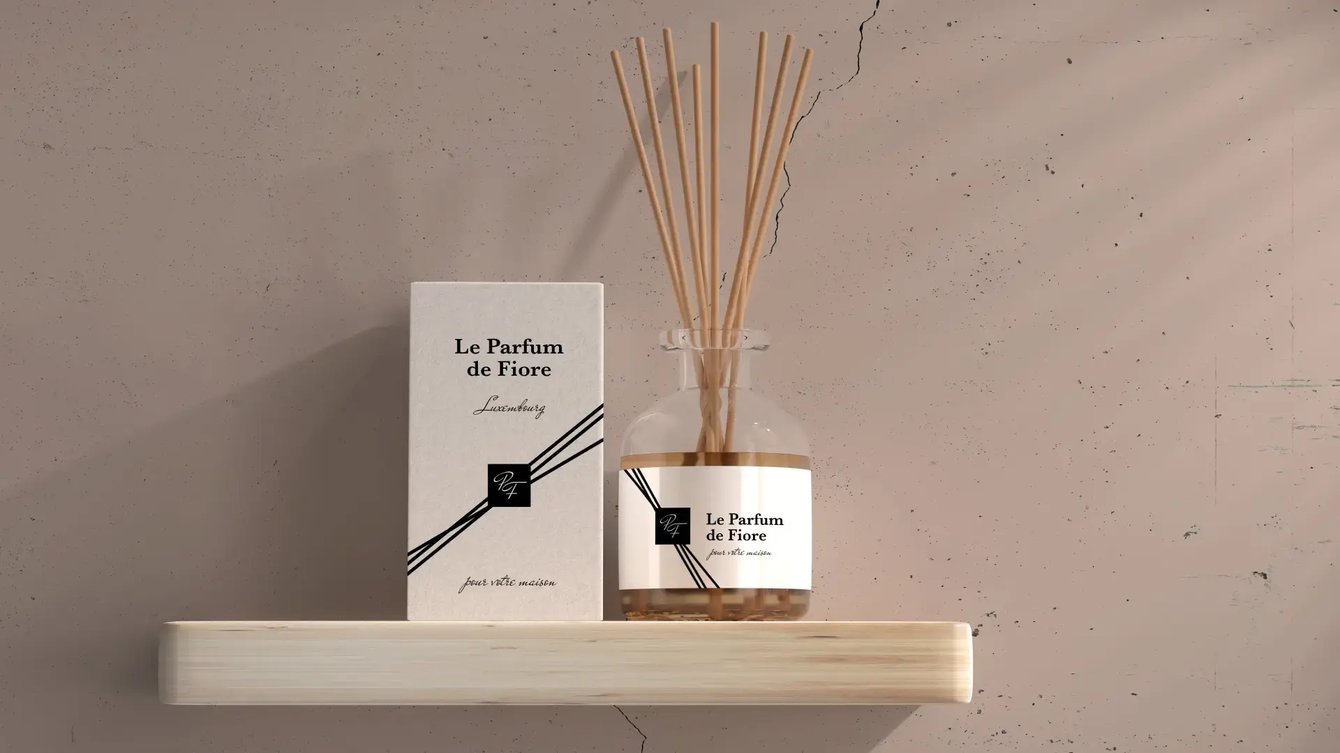
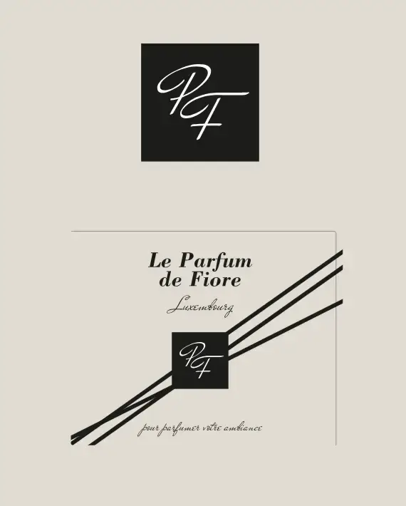
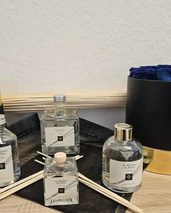
BRAND IDENTITY and PACKAGING

Label Design for Le Parfum de Fiore

Client
Fiore Immo
Sector
Real estate
visual lab parfum fiore

Brand overview

Le Parfum de Fiore
Fiore Immo
pf logo
Fiore Immo is a Luxembourg-based company operating in the real estate sector and in the enhancement of interior spaces. With “Le Parfum de Fiore,” the brand aimed to expand its scope by introducing a high-end line of home fragrances, designed to add elegance and olfactory identity to both residential and professional environments.
visual lab parfum fiore 4

Le Parfum de Fiore

Necessità

The goal of the project was to create a distinctive label for the new fragrance diffuser, one that could convey its refinement and reinforce the brand’s premium image. The label needed to be understated yet impactful, easily recognizable, and aligned with the product’s elegant and modern positioning.


Special attention was given to the graphic design, which had to evoke the sensory experience of the fragrance through a visual language that was both immediate and sophisticated.

What we have done
Logo Design Brand Identity Packaging
Results

We designed a minimalist and refined label, built around a black-and-white contrast, with the “PF” monogram prominently placed at the center, enclosed within a compact and bold square. The dominant visual element is made up of three diagonal lines crossing the label—a stylized and contemporary reference to the wooden sticks typically used in fragrance diffusers.