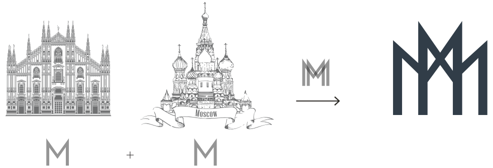
We designed a logo that effectively captures the identity of Milmos, starting from a strong concept: the connection between Milan and Moscow. This led to the idea of using two stylized, mirrored M’s to represent the two cities that shape the company’s world. The result is a distinctive graphic mark, with a clean and contemporary style, capable of evoking solidity, symmetry, and international scope. A logo that not only visually represents the essence of Milmos, but also strengthens its market presence and supports its growth as an authoritative player between Italy and the CIS region.


